Till these broken years were healed
10:01 AMDid more browsing. And today's site is Lovely Package!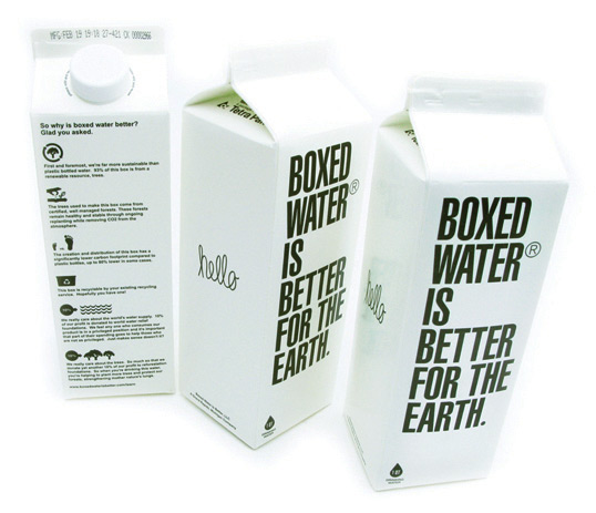
Kevin Hockin from Boxed Water sent us some photos of their newly launched product. With a package that is more sustainable than plastic bottles, they’ll be giving away 20% of all profits. 10% to world water relief and 10% to reforestation foundations.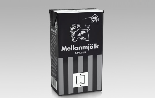
Designed by Milk | Country: Sweden | Fonts used: Futura
“Swedish advertising agency Milk has turned the classic white Arla milk carton black.
It is a campaign for WWF’s Earth Hour. A worldwide event encouraging people to raise environmental awareness by turning off the lights for one hour.”
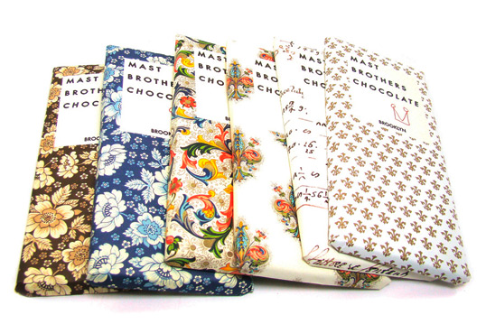
Beautiful detailed packaging for Brooklyn based artisan chocolate brand, Mast Borthers Chocolate. If anyone knows who is behind this amazing design work please let us know.
Images via Shop Composition.
Fonts used: Metro.

“The drink has been around since 1931 and operated during World War II with dirty means a tough campaign against his greatest enemy, Coca-Cola. During the 1960s it seemed as if the African Cola was losing cola war in the German market. In an attempt to gain market share redesign was the bottle of Jupp Ernst.”
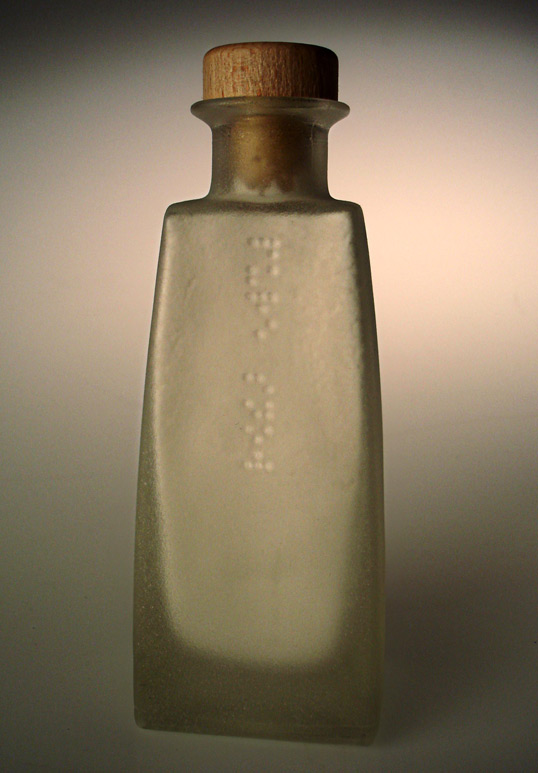
“A concept bottle design containing pure alpine snow powder, without any additives used for aftershave ~ as nature intended. The target audience for this aftershave is for men who appreciate all in nature, for
example Sir David Attenborough.
The braille simply reads, ‘pure snow’ on one side and ‘aftershave’ on the other. Additional information is not necessary as it is what it is. The way the Braille falls down the bottle like snow is very deliberate, it is also molded into the glass, and this takes away an additional sticker.”
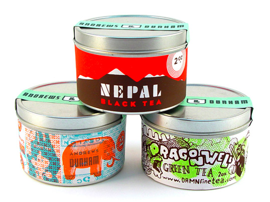
Thanks to Aesthetic Apparatus for sending in this great work that they designed and printed for Andrews & Dunham teas.
Fonts used: Futura Black, hand lettering.
Seriously. If you're a packaging admirer, check out the Lovely Package. It's pretty solid stuff :D

0 comments